The Alhambra and The Alcazar (Spain)
The Palaces
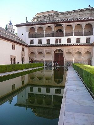
The Alhambra and Reales Alcázeres are palaces in Spain dating to the 14th century. The rulers who had these building constructed were Moors and hence Moslims. Their art consists to a large degree of geometric designs.
The Reales Alcázeres is also known as Alcázar of Seville. This royal palace was built in the 1360s. The Alcazar is listed as a Unesco World heritage Site.
The Alhambra dates from the same time period. Like the Alcazar, the Alhambra was also originally built as a fortress, and later used as a palace. The Alhambra is also listed as a Unesco World heritage Site.
The Alhambra is one of the sites visited by MC Escher during his younger years. Escher sketched some of the patterns he saw at the Alhambra, and further sketches of his from Cordoba are also well-known.
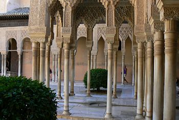
The Alhambra is a large palace and one can visit the gardens as well as the palace grounds.
 |
|
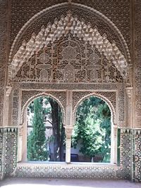
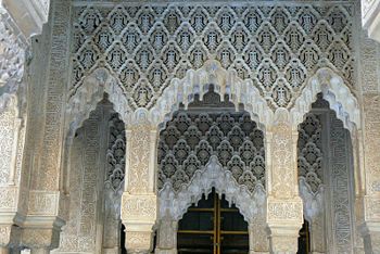
The designs throughout the Alhambra are very symmetric in nature. Below we see a window with a view of the palace gardens. The outline and the decoration above the window show reflectional symmetry.
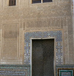
Around the doorway - show in the middle picture - we see examples of border patterns. More borders are visible just above the tiling that makes up the bottom of the wall. Also note the intricate designs above the pillars in the right hand picture.
 |
 |
|
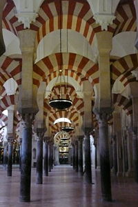
La Mezquita in Córdoba, Spain is a mosque converted to a catholic Cathedral. Escher visited this site as well and sketched the pillared halls.
 |

|
The design of the Mezquita is very symmetric in nature. The photographs below clearly show the reflectional symmetry in the layout of the building.
 |

|
Rosettes
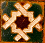
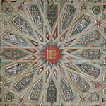
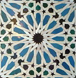
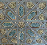
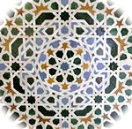
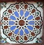
There are many examples of rosettes. Sometimes the rosette shows up as a seperate tile. Other times we can lift a patetrn from a larger border or tiling. The most common rosettes in these palaces are ones with no reflectional symmetry. Quite a few of the rosettes are created with ribbons showing under- and over-crossings. Any such ribbon work usually leads to what we call a purely cyclic pattern. The only symmetries present are rotational symmetries.
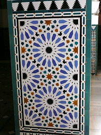
Some of the panels on a wall may be decorated with one pattern. Such larger panels often have just 2 fold rotational symmetry, even though smaller components may have more symmetry than that.
 |
 |

|
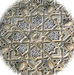
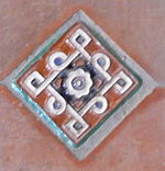
In close-up we see some of the individual smaller rosettes. The most common rotational symmetries are of degree 4 and 8. An ocassional design with no symmetries is possible.
 |
 |
 |
|
 |
 |
 |

|
Border Patterns
Border patterns are quite interesting, and they appear as borders to the larger tilings, but they also appear on some of the benches as decoration. Note for instance the borders decorating the back and the bottom part of this seating area:
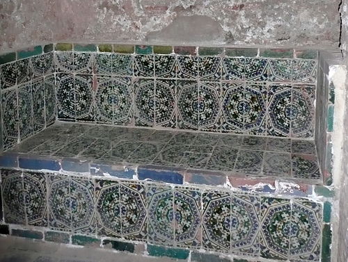
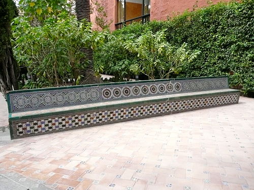
This bench - outside on the grounds - shows a tiling across the front of the seat:
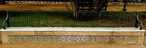
This bench shows three different border patterns on the back of the seat and the pattern on the front also appears as a full tessellation on some walls.
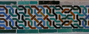
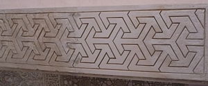
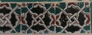
Below are several more examples of border patterns. Some of these appear - quite literally - as the border of other tilings. While some of the borders are used to frame doorways and passages. The borders can appear both horizontally and vertically, but have been mainly shown here horizontally.
 |
 |
|
 |
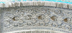
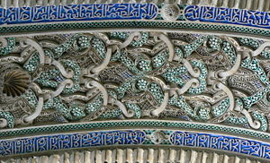
The underside of some of the arches also show border patterns. Some of these patterns are quite intricately carved.
 |
|
Wallpaper Patterns
There are many different types of tilings and the easiest way to show some differences is to look at the orders of rotation. In general we can have no rotation, 2-fold rotation, 3-fold rotation,4-fold rotation, or 6-fold rotation.
No Rotation
This tessellation has no symmetries besides translations. We can choose any part of the tiling and note that nearby we will find copies of that specific pattern which repeats itself.
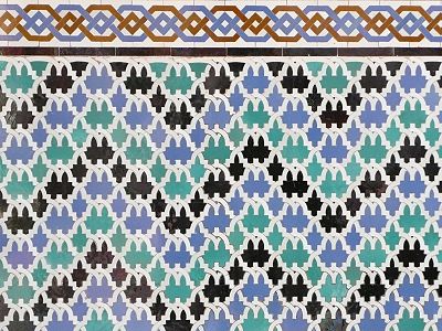
There is almost reflectional symmetry, but the under and over crossings prevent there from being true mirror lines. Note the simple border pattern just above the tiling.
Another possibility is that there are reflections and glide-reflections present. Below we see vertical mirror lines.
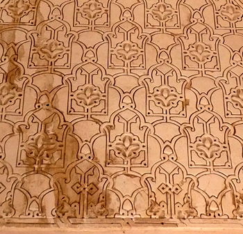 |
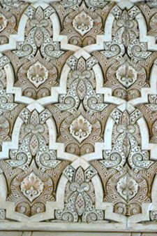
|
2-Fold Rotations
Below we see the same pattern used on a wall (left) and on the side of a bench. The difference between the two tilings is just a matter of rotation. If you tilt your head slightly to the right on the left tiling, you will see the same pattern that appears on the bench (right). A small difference is that somehow some lines appear in the side of the bench which line up with some of the mirror lines.
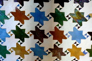 |

|
The tiling on the left looks a bit like bats. There is still a 2-fold rotation and there are mirror lines. Mathematically speaking it is similar to the ones above. Similarly the geometric tiling on the right is mathematically speaking similar because it has the same types of symmetries.
 |
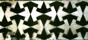
|
3-Fold Rotations
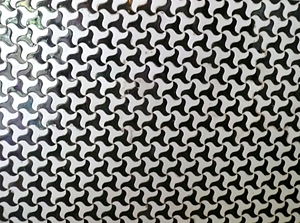
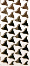
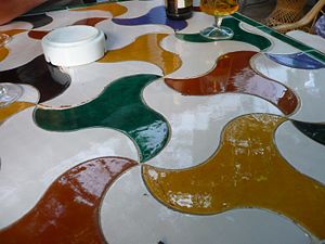
These three tilings are really all the same. On the left we see a tiling of a wall. The curved sides of the triangular shapes prevent any reflectional symmetry, but 3-fold rotations are present. The carved wall in the center has the same pattern, but here some of the triangular pieces have been removed. The tiling on the right is mathematically the same. the only difference is the use of color. The image on the right is a table top.
 |
 |
|
A slight variation of this pattern is shown below. The pattern still shows 3-fold rotations and there are no reflections.

4-Fold Rotations
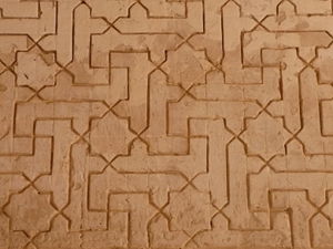
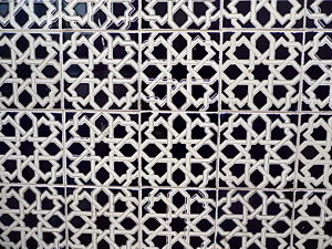
Several tilings show 4-fold rotations and no reflections. Below we see an interesting tiling with a border below and two different border patterns above the tiling. When looking closely, one can see that there are crossings that prevent any reflectional symmetry.

More examples show that even though the symmetries are the same, we can still create different looking patterns.
 |
|
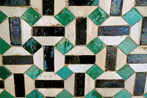
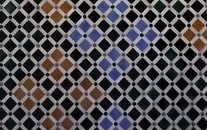
It is also possible to have tessellations with 4-fold rotation and reflections as shown below.
 |
|
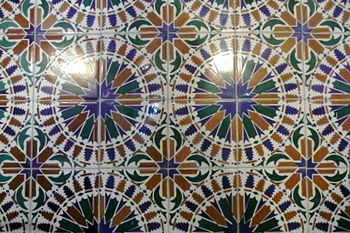
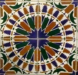
In some of the tessellations it's possible to see the actual individual tiles.
 |
|
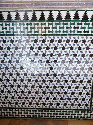
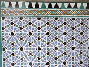
6-Fold Rotations
 |

|
|
Some Interesting Uses of Motifs
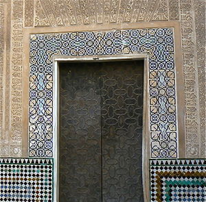
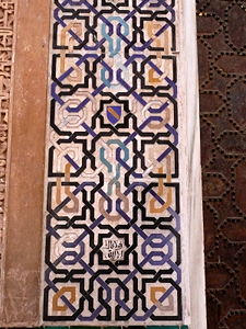
There are places where a similar idea is worked out in a variety of different ways. For instance the knotted border around the entrance below also appears in a smaller border elsewhere. And the motif has also been expanded to cover an entire wall.
 |
|
The smaller border has fewer knots:

The whole wall has a much more intricate pattern:

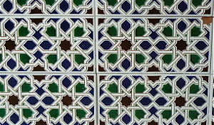
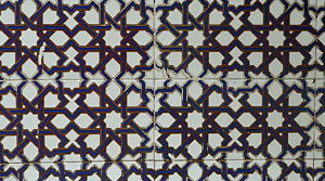
The following designs are really the same. The difference is the choice in color.
 |
|
And this version is created using even brighter colors.
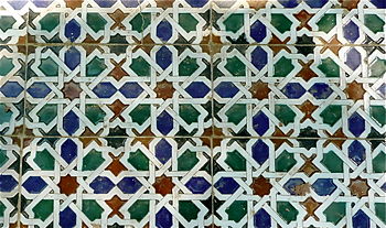
Looking at the tiles it is even more obvious:
 |
 |

|